css 笔记整理 —— 一些之前不常用到的方法
一些问题的处理
-
margin collapse:
a. margin-top / margin-bottom 只取其一;
b. 设置 1px padding;
c. 使用 padding 而不是使用 margin参考资料:margin-top in a nested div
-
绝对定位元素的居中实现:
a. left/top 设置 50%,再设置 -margin 为元素宽高的一半;
b. left/top 设置 50%,css3 设置 transform: translate(-50%, -50%) 代替 -margin;
c. position: absolute; left: 0; top: 0; right: 0; bottom: 0; margin: auto;参考资料:张鑫旭:margin:auto实现绝对定位元素的水平垂直居中
-
clip: rect(a,b,c,d) 的运用:a,b,c,d 分别对应 上,右,下,左 到顶部和到左边的距离。
-
url 强制换行:word-wrap: break-word;
CSS3 多栏布局
-
父元素设置:
- column-width:12em or column-count: 4 (举例)
- column-gap: 2em;
- column-rule: thin dotted #999;
选择器相关:
- img[alt="xxx"]
^= 匹配开头 *=匹配包含 $=匹配结尾 - 伪类:
input:not([type="range"])
input:required
input:focus:invalid { background: url('cross.png') no-repeat right }
input:focus:valid { background: url('tick.png') no-repeat right }
判断输入的值是否有效,对应显示“√” or “×”。
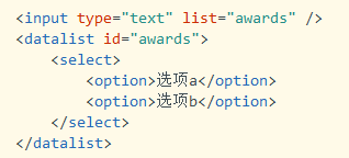
input 的候选列表:list & datalist
CSS3 动画相关:
-
不同时间段过渡不同属性:
transition-property: border, color, text-shadow;
transition-duration: 2s, 3s, 8s; -
transition: property, duration, timing-function, delay
animation: name, duration, timing-function, iteration-count, play-state, delay, fill-mode transform: 具体效果:
scale, translate, rotate, skew, matrix
transform-origin: 20% 20%;3D 变形:
1. 父元素设置:perspective 使子元素获得透视效果;
2. 子元素营造 3D 环境:transform-style:perserve-3d;
3. backface-visibility:元素不面向屏幕是否可见